The HubSpot CRM platform lets you see all of your data in one place, making it easy to get a full picture of business performance on the fly. It also allows you to easily integrate some of your favorite apps without any of the headaches of plugin management to measure, monitor, and report on all of your most important data right within HubSpot.
Why You Need A Data-Driven Business
Data affects your entire organization. Whether it’s cultivating leads, caring for customers, or even communicating internally, with effective data analysis you can implement better commercial strategies across the board.
At its core, data-driven decision-making means making judgments based on information rather than intuition, assumptions, or disjointed observation. Done well, it can allow you to anticipate what your customers need before they even ask.
And what business wouldn’t benefit from being able to see into the future?
Predicting customer behavior enables you to offer a frictionless buying journey. This means you’ll be adding value to every interaction. The delight customers feel when a business delivers that level of satisfaction will not only keep them coming back for more, but it will also turn them into an army of mini-marketers spreading the good word about your service. Can you afford to turn down free marketing?
“HubSpot research has shown that 77% of consumers shared positive experiences with their friends on social media or on review sites.”
Small-to-medium-sized businesses report that word of mouth (including social media) is their single best source of referrals. But at the same time, failing to thrill your customers can be disastrous.
“94% of consumers have discontinued communications with a company because of irrelevant promotions or messaging.”
With so much at stake, you can’t count on your gut or guesswork to keep your customers happy. The more data you have, the more certain you can be in your decision-making.
With information about your target audiences readily available, it’s possible to personalize and optimize at every stage of the customer journey. Everything from behavior prediction, best-fit prospects, user research, beta testing, surveying support channels, industry trends, and more can all be researched, analyzed, and acted upon, if you know what to look for.
But collecting data doesn’t have to be complicated. Sometimes data is right there, just waiting to be noticed. For example, on its way to becoming the world’s most popular music festival, Coachella used data from its online message board to figure out who was the most talked about acts amongst its most enthusiastic consumers. It would then use this information to help decide which performers to book at future festivals.
As Coachella grew and technology evolved, the festival created an app that allowed users to select the artists on the lineup they were most excited to see. Coachella then used the data gathered from the app to help it decide which acts should perform later in the day when more fans were there to enjoy them.
By unobtrusively gathering data from its customers using voluntary platforms, the festival organizers were able to create the best possible customer experience.
No wonder it’s become one of the most famous music events in the world.
This level of data-driven, user-centered approach is at the heart of inbound and crm-powered marketing. Inbound marketing meets customers wherever they are and offers engaging, valuable information to suit their needs.
HubSpot visualizes this business model like a flywheel, with the core activities of attracting, engaging, and delighting the prospect at every stage of their journey. Any forces that make the flywheel spin faster, like investing in strategies that acquire and retain customers, increase momentum and growth. Any friction created, for example, when handing off customers between teams, can cause you to lose steam.
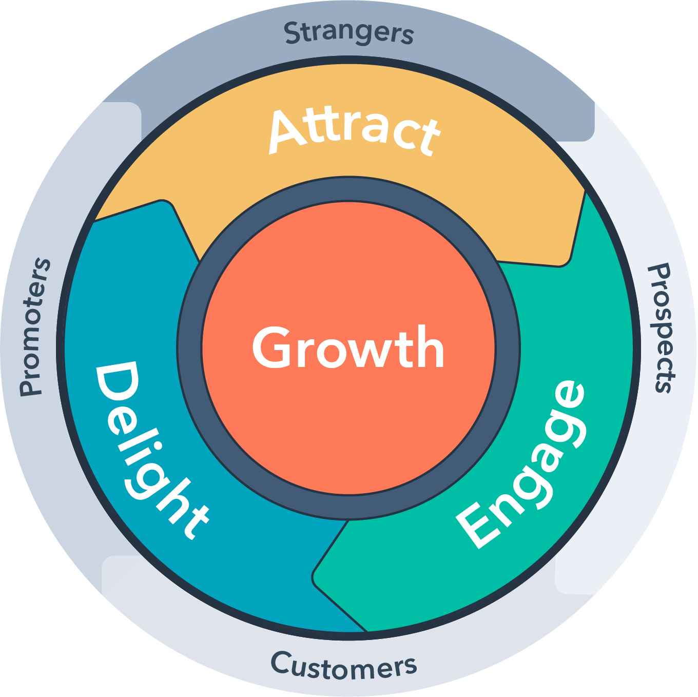
Let’s re-examine the Coachella example through the lens of inbound marketing and the flywheel model.
First, the festival attracted customers by creating an active online community of music fans looking for a place to talk about the music they love.
Next, it engaged those fans by offering a festival full of the same music they talked about online.
And finally, it delighted attendees by creating the best possible experience at the festival using more data it got from those same customers.
What can we learn from this example? Building a company around data means establishing a culture where people are not only driven by results but also driven by learning. This means teams that are not only looking to adapt but also to innovate around the needs of the customer.
Understanding your data
Data literacy is the ability to collect, read, manage, write, communicate, and visualize data. It means being able to find, make sense of, and present back data in a way that tells a cohesive story underpinned by objective truth, not subjective opinion. Not only that, but businesses with a single source of truth also find it easier to collect and collate valuable data to maximize business insight.It’s important to mention that good data is clean data. Maintaining databases and ensuring information is accurate will help you build reports that are always up-to-date and reliable. This is the key to deploying automation that is personalized with confidence.
Well-managed data accurately transformed into visual reports allows every stakeholder in your business to see the information they need to improve their small corner of the world. It also allows them to ensure they see the bigger picture and don’t make detrimental decisions in information silos.
The great news for you is most people end their data journey here. They fail to take the next crucial step and use the information they have to drive meaningful, growth-fueled change. They see reports as a tool to explain what happened without fully understanding their power to let you see into the future and predict behaviors.
But you’re different...
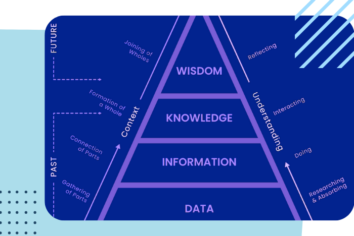
Data management model: DIKW
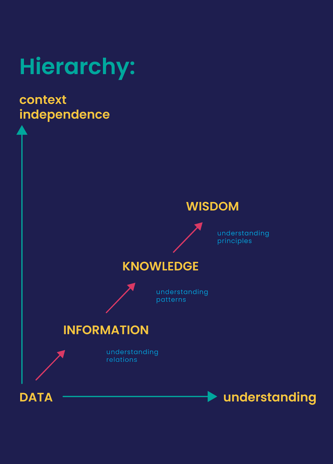
The DIKW model or DIKW pyramid is an often-used method, with roots in knowledge management, to explain the ways we move from data (the ‘D’) to information (I), knowledge (K), and wisdom (W) with a component of actions and decisions.
Essentially, that’s what we do in digital transformation. And with Industry 4.0, IoT, and AI/ML the decisions/actions can also be (semi-)autonomous (although everything depends on the nature and purpose of the data).
DIKW is a model to look at various ways of extracting insights and value from all sorts of data: big data, small data, smart data, fast data, slow data, and unstructured data, it doesn’t matter; we want outcomes, the ‘actionable intelligence’. The DIKW model is also often depicted as a hierarchical model as seen below:
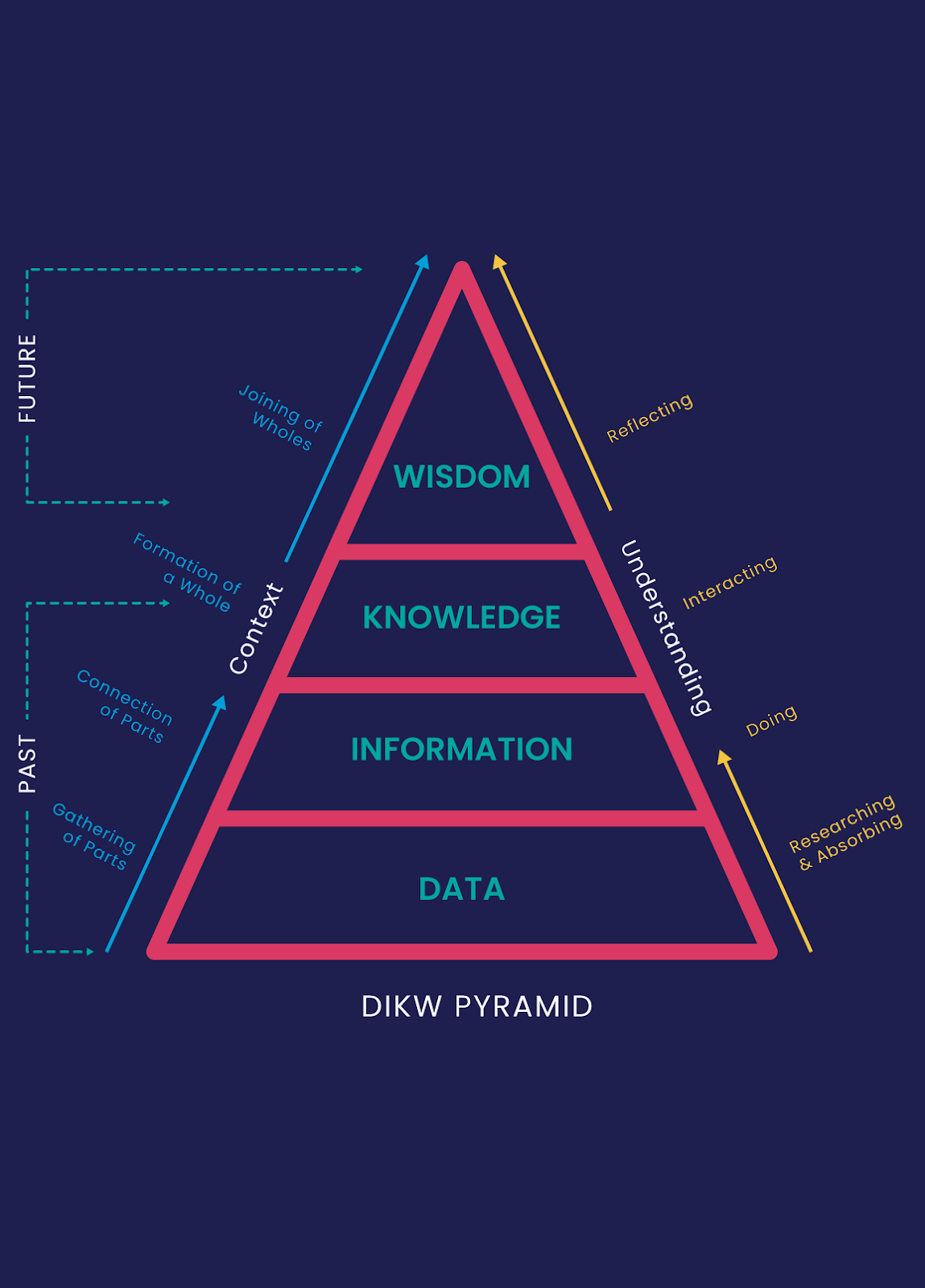
In context, one moves from a phase of gathering parts (data), the connection of parts (information), the formation of a whole (knowledge), and the joining of wholes (wisdom).
In understanding, the DIKW hierarchy can also be seen as a process starting with researching, absorbing, doing, interacting, and reflecting.
These steps fluidly connect the DIKW hierarchy, no step is linked to a particular DIKW step. The DIKW hierarchy can also be regarded in terms of time. The data, information, and knowledge levels are based on the past while the final step – wisdom – looks toward the future.
Data
Logging, records, measurements, etc. are all data. And since data is a mass and includes many things, it needs to be contextualized to make sense: data alone does not provide meaningful results.
Information
Let’s consider that one million subscribers use the SMS service of a telecom operator in the United States. Alone, the one million tells us nothing other than a volume. Why? When? How? These are the questions that still need to be answered IF that data set is to become useful.
For example, if one million SMS service users are analyzed, it could be found eight hundred thousand users using this service are in the 15-25 age range with 80% using the service between seven pm to eleven pm in the evening.
And if you take it one step further and also work out that 90% of these users use SMS service when there is no internet connection on their cell phone, things start to get interesting. The analyzed data becomes information.
Knowledge
The third level in the DIKW hierarchy is Knowledge. The Knowledge step aims to answer the How? question. Specific measures are identified and the information gained in the previous step is used to answer questions based on these measures, such as ‘How do teenagers use SMS services?’
Wisdom
The fourth and last step in the DIKW hierarchy is Wisdom. At the Wisdom stage, the knowledge found in the previous step is applied and implemented. Wisdom is the top-level reached in the DIKW hierarchy and answers the ‘Why?’ question.
If we consider our example scenario, an example of wisdom gained might be that 95% of the SMS service users use this service for short communication when they do not wait for a response from the other party. For instance, when a user wants to say goodnight to another party, or if someone arrives at the meeting point and seeks to notify another person, etc.
As you see, starting from the usage data of the SMS service from the beginning, we processed the data in the Information and Knowledge stages, and we found at the Wisdom step that most of the SMS users use this service for short communication with the other party. This is an example of how an IT service provider used the DIKW hierarchy as a model to convert data into actionable results based on wisdom.
Insight And Actionable Steps From Data
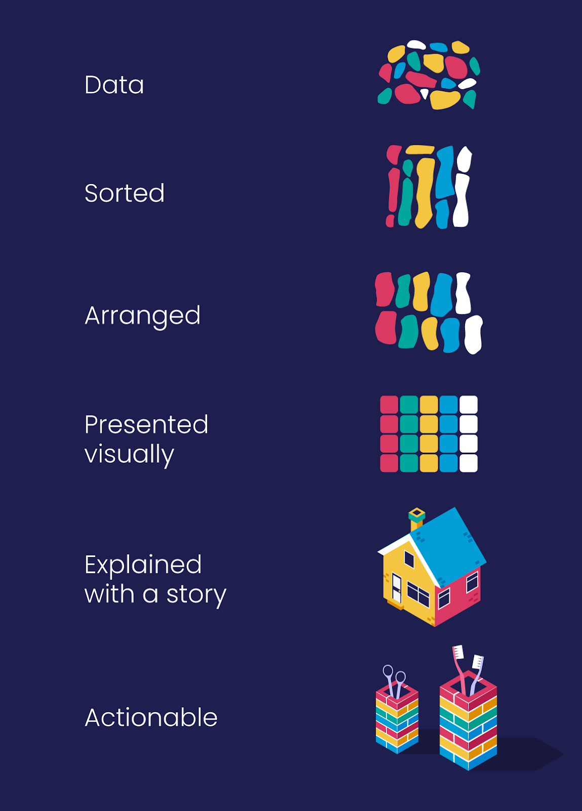
To gather useful insights from data, you need clear reports displayed in an easy-to-understand format.
Once your data has been collated and sorted into a clear pattern (such as a graph), you’ll need to put this data into context and explain what’s happening. Look at a graph and see 5 good days where you get 200 form submissions and then 2 poor days where you see below 20 form submissions. The context you need is to find out which days the bad days are - are these weekends? Mid-week? What correlation is there between product usage and these days? Add context to your data visualization before you can interpret the data and turn it into insight or wisdom.
Storytelling & data
When presenting data, you need to keep in mind that a bunch of graphs tossed onto a dashboard does not necessarily make a good story. Data visualization and the way you lay out your data will help you weave together a story that helps tell a meaningful story.
Using data to tell a story is about sharing the reason why results occurred and weaving in context to the information you are sharing. It isn't about telling a narrative that suits your objective but rather adding context to your results in such a way that the information you’ve gathered provides actionable insights and meaningfully drives your business forward.
Poor results should be presented in context and with the hope of finding a way to either mitigate this in the future or to understand what happened. Using the DIKW model, you could share the results, what happened at the time, or what factors affected this result and then share insights regarding future actions that you could act on due to these insights.
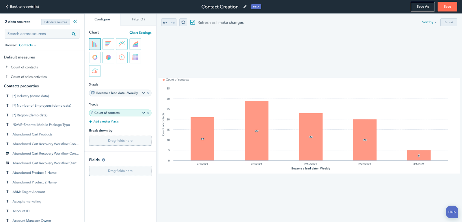
Reporting Tools Available within HubSpot
One of the advantages of the HubSpot CRM platform is the powerful reports that come standard with each tool. Tools like Sequences in Sales Hub, Social or Traffic Analytics in Marketing Hub, Knowledge Base in Service Hub, and Website Pages in CMS Hub all have their reports covering those specific tools.
Here are the reporting tools available in HubSpot and how you can use them:
In-Tool Reports
Tools like Ads, Social Media, Sequences, Workflow, and Knowledge Bases all have reporting dashboards or analysis tabs available. These tabs offer insights on common metrics associated with these tools such as impressions, open rates, conversions, etc.
These dashboards show the most common reports that anybody using these tools is likely to ask about the performance of the particular tool and actions you’re taking. While simple, these reports are powerful in helping determine which assets are performing and driving both traffic and conversions.
Analytics Tools
A powerful set of standard tools that show the analytics on sources of traffic, contacts and customers, lifecycle stage reports, and more. These reports allow you to track the sales or service activity, understand which campaigns drive results, and track the changes in your recurring revenue.
These standard reports come standard within the relevant HubSpot packages/hubs as indicated below:
- Traffic Analytics (Marketing Hub Professional, Enterprise, CMS Hub Professional, Enterprise)
- Sales Analytics (Sales Hub Professional, Enterprise)
- Custom Behavioural Events (Marketing Hub Enterprise)
- Contact Analytics (Marketing Hub Professional, Enterprise)
- Campaign Analytics (Marketing Hub Professional, Enterprise)
- Sales Content Analytics (Sales Hub Professional, Enterprise)
- Form Analytics (Marketing Hub Professional, Enterprise, CMS Hub Professional, Enterprise)
- Revenue Analytics (Sales Hub Enterprise)
Custom Reports: Single Object
Analyze contacts, companies, deals, tickets, custom objects, activities, line items, or feedback submissions.
Custom Reports Builder
An advanced report builder that enables you to analyze objects concerning marketing, sales, and service activities.
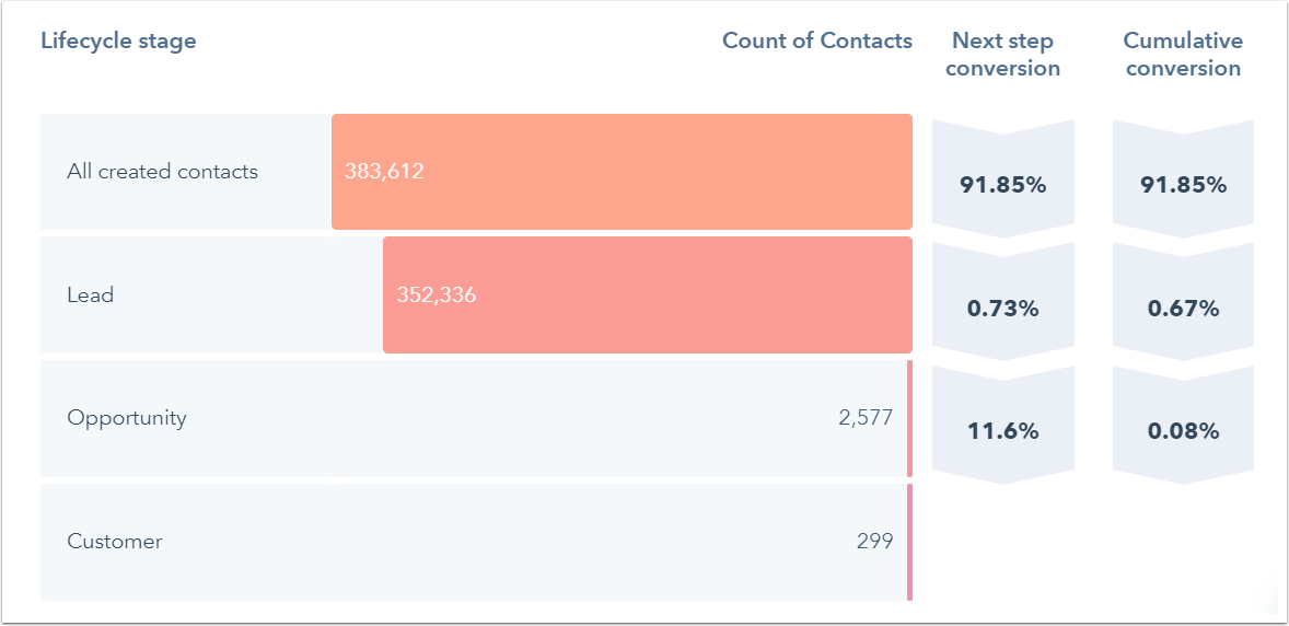
Funnel Reports
Measure the conversion rates between certain stages in a customer's lifecycle or deal's pipeline. If you have an Enterprise subscription, you can also create a custom events funnel.
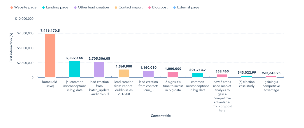
Contact attribution report
Measure which sources, assets, and interactions impacted lead generation (Marketing Hub and CMS Hub Enterprise only).
Deal create attribution reports
Measure which sources, assets, and interactions impacted deal generation (Marketing Hub Enterprise only).

Revenue attribution reports
Measure which sources, assets, and interactions had the greatest impact on revenue (Marketing Hub Enterprise only).
HubSpot Dashboards

Know why you’re creating your dashboard
When it comes to building a data dashboard, ask yourself, “what problem does this board need to solve?” Forcing a dashboard when one isn’t needed is a great way to waste time and resources. Understand the purpose behind your board, and your goals then what necessary metrics you need to identify, measure, and improve.
To start, focus on the five to ten most important metrics and report on those per dashboard. If you do, you’ll have a clear understanding of when you’re adding value to the problem and when you’re not and will help tell the true story to stakeholders.
Not all clients are created equal. They come in many shapes and sizes and are often looking for different metrics depending on their department. Defining your target onlookers will help you:
- Ensure you’re creating the right board, for the right people.
- Better understand how to communicate and act on the right data.
- Increase the likelihood the dashboard will be well-received.
Start by asking yourself a few questions:
What problems does this board need to solve?
Most teams have some understanding of why they exist. Your data dashboard should be related to that purpose and align with the target group’s overall objectives.
What metrics are most important to the target group?
Choosing the right metrics depends on many factors including the type of offering or product, business model (B2C/B2B), industry (e-commerce/SaaS), job function (product/marketing/sales), and more.
What does the group stand to gain from this dashboard?
Great metrics lead to insights — which lead to actions and results. Write down what clarity observers will walk away with after looking at the board.
Once you answer the questions above, you’ll have a better idea of who’s looking at your dashboard and can determine how in-depth you need to go with tracking.
Designing your Dashboard
Place your most important metrics in the top, left-hand corner. Structuring content to read from left to right is one of the best ways to improve comprehension.

If your viewer skips something or gets distracted, you want them to remember the essential details. You don’t want them to miss out on the good stuff because it lives in the wrong place.
Group-specific
Group-specific data in dashboard components
There is nothing worse than going to a data dashboard and the information is all over the place. When you’re creating your data dashboard, focus on specific topics and groups. Grouping content together in a clear way is important to give a complete overview of data. Plus, it helps viewers access the right information, at the right time.
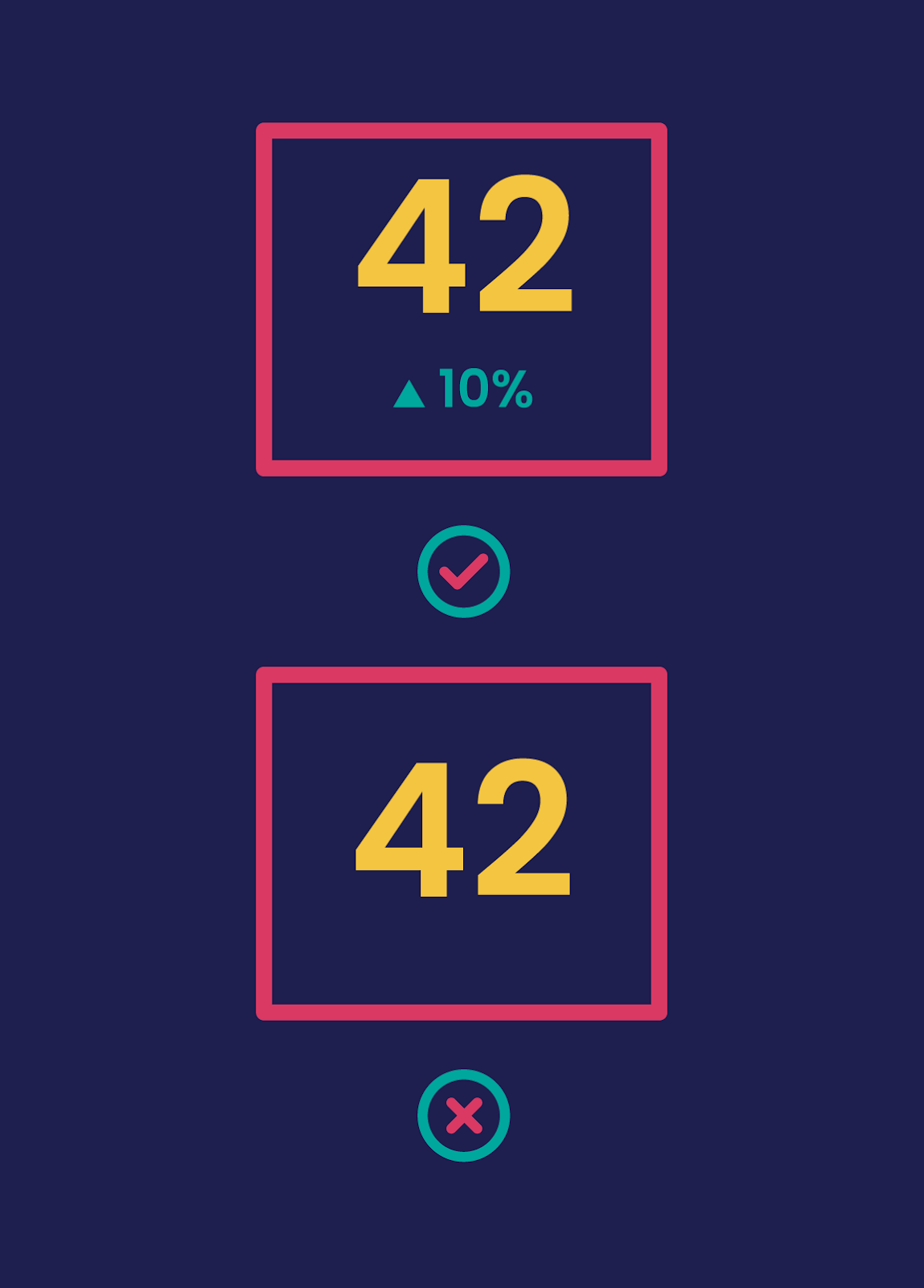
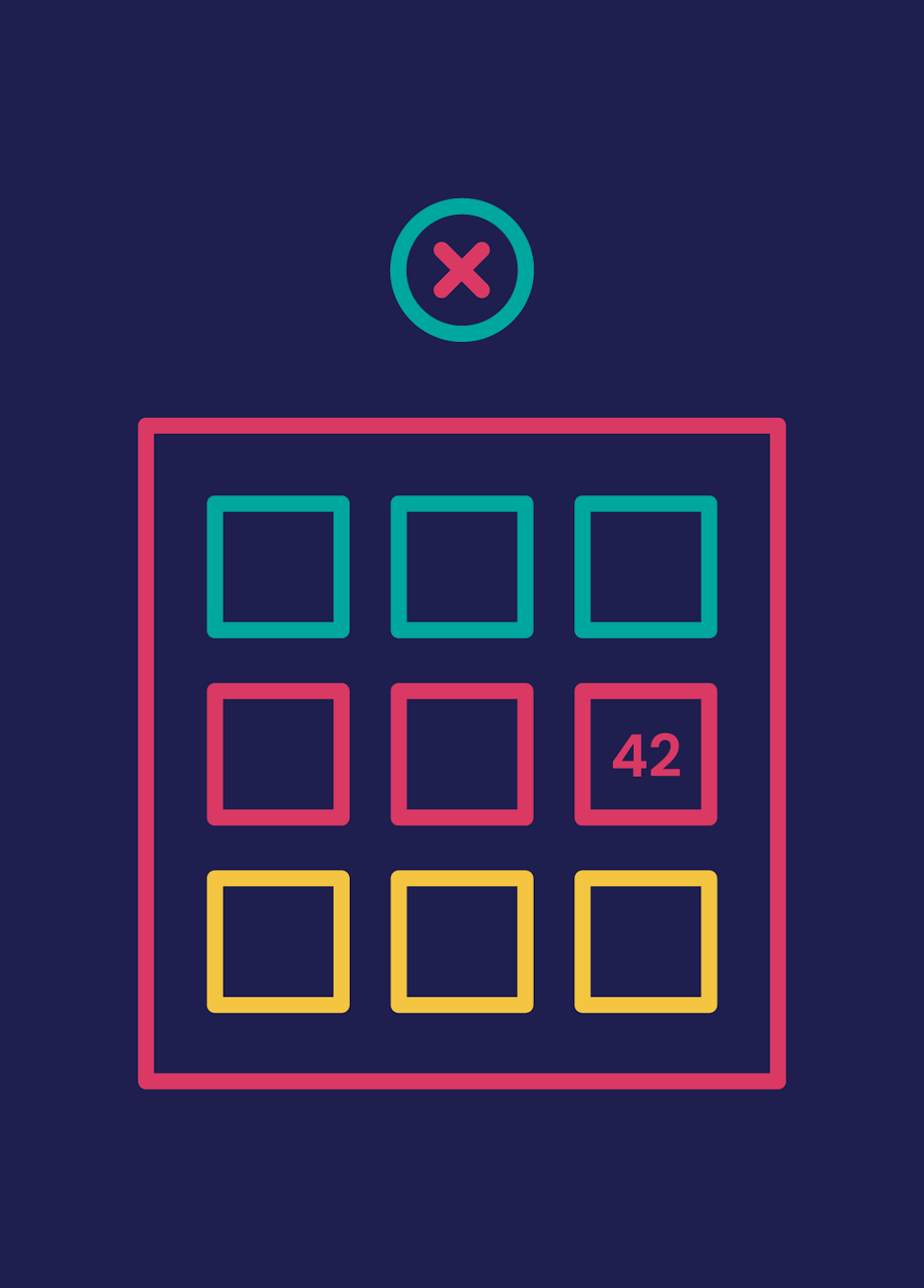
Give your numbers context
To know if a number’s good or bad your viewers need context. Would they know, for instance, that 42 new leads today is out of the ordinary?
One of the easiest ways to do this is to include past data. You could include the same metric for the previous day, or even a line or column chart showing how the metric tracks over a longer period. Another technique is to include the average or previous highs and lows.
If you’re working towards a goal, include the target as well as your current progress.
You can also add warnings for when a metric is above or below a certain threshold to make it easier to spot problems.
Use text blocks to communicate cause and effect
Another important thing to note is that all of your business data is related and changing. One thing in your business may affect multiple data points across many of your dashboards.
One of the hardest things to do is to spot and understand how one data point or set of data points correlates to another. We also recommend adding text blocks within your data to help identify different sections and even give your notes on how the data correlates. Doing so will make it much easier for your audience to understand what the data is telling you.
Remember to set the correct time frames
It’s easy for data to lie. One of the easiest ways to have your data lie to you is to have incorrect, inaccurate, or inconsistent time frames.
If you’re preparing several pieces of data for presentation, each piece likely needs to be set to the same time frame to avoid confusion or false assumptions.
Sometimes having different time frames is necessary. In most cases, it’s critical to clearly outline the different time frames and why they are different. The last thing that you want is the person that the data was prepared to misinterpret because they don’t realize that the time frames are not the same.
This last tip builds on the last one, but it’s important to account for how you’ll share your dashboards with a client. This can change how you structure the dashboard and what information you spell out clearly.
If you’re presenting the data in person, you can leave out some text blocks and explain the data within your presentation. However, it’s more likely you’ll be sending the dashboard to your audience and they’ll view the data on their own. If this is the case, give as much detail and explanation as possible. You don’t want your audience to misinterpret a data point in the dashboard — it could result in poor business decisions and mistakes.
Keep evolving your dashboards
Our final piece of dashboard design advice is the most important. Once you’ve built your dashboard don’t just leave it. Ask your team for feedback.
- What do they look at most often or find most useful, and why?
- What do they never look at or find least useful, and why?
- Is there anything missing that they’d find useful?
- Has it changed anything about the way they work?
Use this feedback to iterate your dashboard. Check your dashboard is driving the behavior you intended. Step back from your board now and then and look at how all the elements work together. Remind yourself what information you’re primarily trying to get across and how effectively those important elements stand out.
As your goals and priorities change, make sure you update your board so it acts as the heartbeat for whatever you’re doing.
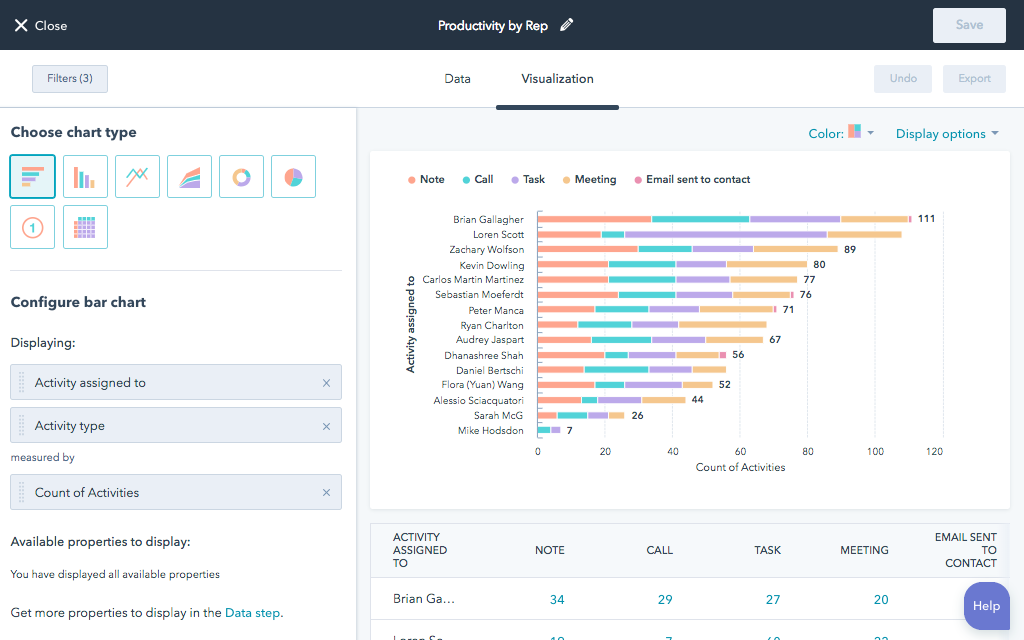
Building Custom Reports
A HubSpot custom report, however, enables you to dive into the details. For instance, with a custom report, you can further analyze the data at hand or review it in-depth, compare activities, and more.
Therefore, with custom reporting, you can analyze various objects and integrations in one place. This means you can have all your data sources in one spot rather than having to join data in Excel from scratch for building a report on another software.
To get started with creating a HubSpot custom report, you need to have four things in place:
- Your data set – this includes contacts, products, companies, activities, etc.
- Properties – these are the properties of your data set objects.
- Filters – you can set filters to get more specific. For example, you can filter contacts by their city.
- Visualization – this is how you will display your data, in an area graph, pie chart or table among many other options.
Once you’re done making your HubSpot custom report, you can name and save it to your reports lists or dashboard. You can also export it to save it on your device.
5 Questions for Deciding Which Type of Chart to Use
1. Do you want to compare values?
Charts are perfect for comparing one or many value sets, and they can easily show the low and high values in the data sets.
To show a comparison:
- Column
- Mekko
- Bar
- Pie
- Line
- Scatter Plot
- Bullet
2. Do you want to show the composition of something?
Use this type of chart to show how individual parts make up the whole of something, such as the device type used for mobile visitors to your website or total sales broken down by sales rep.
To show composition:
- Pie
- Stacked Bar
- Mekko
- Stacked Column
- Area
- Waterfall
3. Do you want to understand the distribution of your data?
Distribution charts help you to understand outliers, the normal tendency, and the range of information in your values.
To show distribution:
- Scatter Plot
- Mekko
- Line
- Column
- Bar
4. Are you interested in analyzing trends in your data set?
If you want to know more information about how a data set performed during a specific period, there are specific chart types that do extremely well.
To show trends:
- Line
- Dual-Axis Line
- Column
5. Do you want to better understand the relationship between value sets?
Relationship charts are suited to showing how one variable relates to one or numerous different variables. You could use this to show how something positively affects, has no effect, or negatively affects another variable.
To show relationships:
- Scatter Plot
- Bubble
- Line
Advice For Building Reports
One of the advantages of the HubSpot CRM platform is the powerful reports that come standard with each tool. Tools like sequences in Sales, Social in Marketing,
- Balance text with visuals to make your information easy to digest.
- Use a single highlight color to draw attention to key information.
- Create a clear text hierarchy to make your report easy to navigate.
- Incorporate your branding for a cohesive report design.
- Visualize your data with bar charts, line charts, bubble charts, and pie charts.
- Use a 2-column layout for optimal readability.
- Leave plenty of whitespace in your report design.
- Apply consistent motifs across every page of your report design.
- Use color blocks to group related information.
- Include an appendix with detailed tables and graphs.
Building great dashboards
Layout: How You Distribute Content on the Page
Break up the text into short paragraphs and bulleted points so that it’s easy to skim (no "wall of words" to discourage your readers).
Keep the layout simple and uncluttered, with plenty of margins and white space (blank areas that give the eyes a chance to rest).
Left justify the text to make it easier to read. Readers sometimes overlook titles that are centered.
Font Size and Type
Make the text large enough for easy reading and choose highly readable fonts. Serif fonts have little strokes at the ends of letters; sans-serif fonts do not.
For Web reports, experts usually recommend using a sans-serif font for easy on-screen reading.
For printed reports, experts tend to recommend using a serif font for the main text and a sans serif font for headings, subheadings, and labels. Choose serif and sans serif fonts that are both easy to read and contrast well with each other.
Use boldface type to highlight important words and phrases. But use it sparingly, because large blocks of text in bold are hard to read.
Font Color and Contrast
Maintain high contrast between the text and background. Black text on a white or very light background is the most readable text.
Be cautious with colored text. Never put text in light colors such as orange or yellow against a light background.
Minimize the use of “reversed-out” text (light text on a dark background), which is hard to read, especially in printed material. Also, if users will be printing the report themselves, reversed-out text requires too much ink, making printing costly.
Avoid printing text on colored backgrounds unless the background is very light (such as pale yellow). Shading the background reduces contrast and makes the text harder to read. For ease of reading, do not put text on top of photos or patterned backgrounds.
Make It Easy To Navigate the Report and Pick Up the Main Points
To guide people smoothly through your report, use text and graphics in combination to give clear, consistent navigation signals.
These signals help people notice what’s in the report and help them find the parts of personal interest without distracting or misleading them.
Use plenty of informative headings and subheadings. Make them pop out for easy skimming by creating a strong contrast between the text and the headings and leaving enough space around the headings.
Be consistent.
Consistent design helps orient people, facilitates skimming, and enables easy navigation through the report.
Keep the overall page layout and design features consistent
Although each page in your report may have different content, the basic design should be consistent. Keep the formatting of titles, headings, bulleted lists, labels, and other text the same throughout the report (same font, size, color, and so on).
Provide persistent navigation links for the main headings and keep them in the same position on each page.
Looking for help building insightful reports in HubSpot? Contact our team and we can assist you in building impactful campaigns and insightful reports to help track your campaign conversions.